Refreshing a trusted brand for a new generation of families.
Expertise
Visual Identity Design
Editorial Design
Website & UI Design
Credits
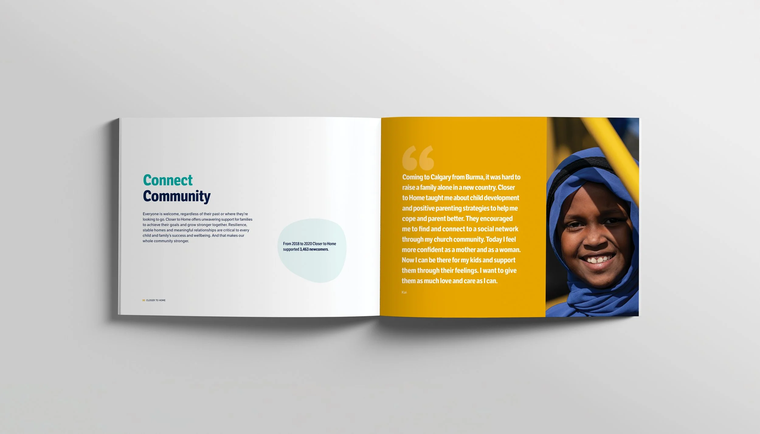
Client: Closer to Home
Role: Lead Designer
Agency: Strut Creative
To help TELUS Spark raise $45 million and redefine itself as a world-class science centre, I created the Keep Calgary Curious campaign. It aimed not just to raise funds, but to ignite imagination, civic pride, and make science personal and accessible. Centered on the idea that curiosity drives discovery, the campaign invited Calgarians to reconnect with wonder and envision their role in science’s future.
Targeting philanthropists, leaders, and citizens, I developed creative tools—ranging from printed and digital materials to a bold social content strategy—that positioned curiosity as the campaign’s core narrative. Inclusive messaging inspired donors and reminded the community of science’s vital impact.
Through storytelling and design, the campaign elevated Spark’s vision as an accessible, inclusive, and globally relevant centre, motivating Calgarians to invest in a brighter, imaginative future.